
The Visual Display of Quantitative Information by Edward R. Tufte ⭐️
The classic book on statistical graphics, charts, tables. Theory and practice in the design of data graphics, 250 illustrations of the best (and a few of the worst) statistical graphics, with detailed analysis of how to display data for precise, effective, quick analysis. Design of the high-resolution displays, small multiples. Editing and improving graphics. The data-ink ratio. Time-series, relational graphics, data maps, multivariate designs. Detection of graphical deception: design variation vs. data variation. Sources of deception. Aesthetics and data graphical displays. http://www.edwardtufte.com/tufte/books_vdqi
Very short, but information dense book with strong opinions and examples, easily against modern nonsense conventions (color, pie charts etc).
Replace conventional tables of numbers with the systematic visual representations.
Provide language for discussing visual graphics.
Graphical excellence consists of complex ideals communicated with clarity, precision and efficiency.
Give viewer ideas.
- show/reveal the data
- induce the viewer to think about the substance rather than about methodology, technology, production, …
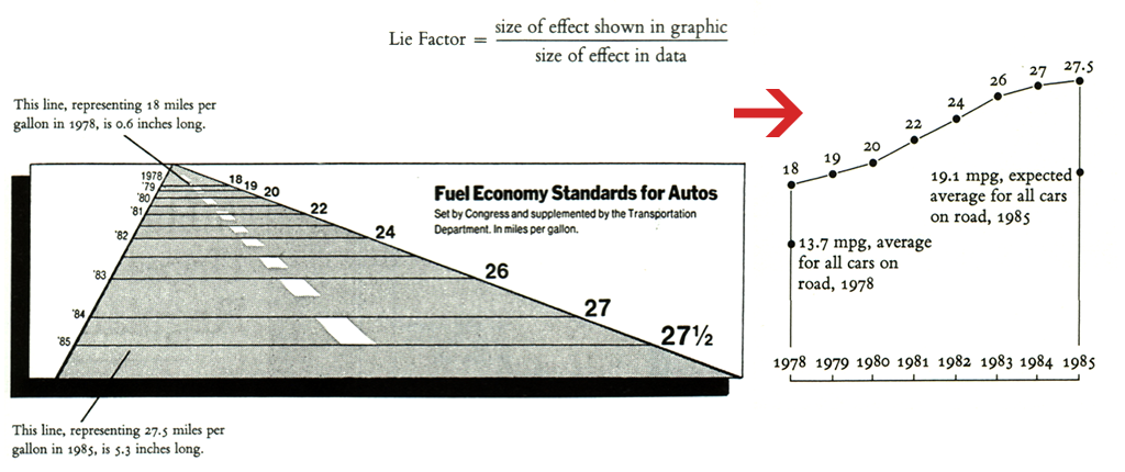
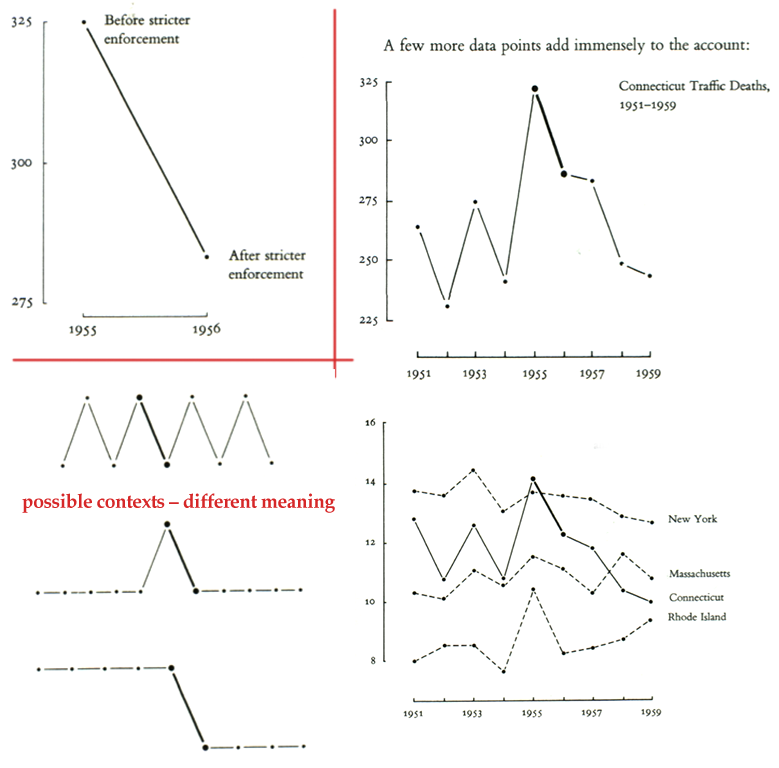
- avoid distorting what the data have to say
- present many numbers in small space
- make large data sets coherent
- encourage the eye to compare data
- reveal data at several levels of detail – from a broad overview to the fine structure
- Substance
- Statistics
- Design
Statistical graphics are only as good as what goes to them
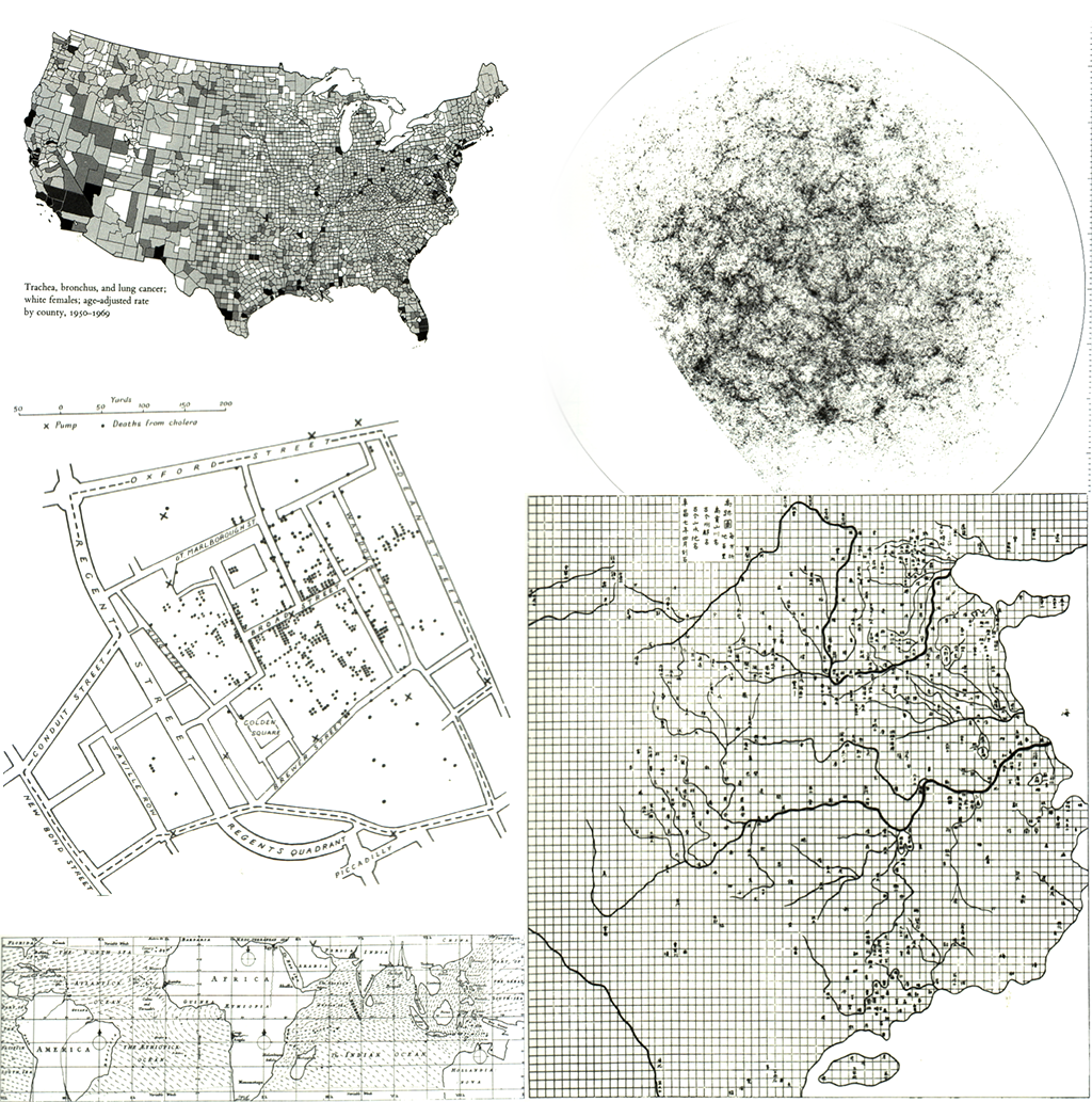
- Visualisation show data in comparative perspective.
- Only a picture can carry such a volume of data in such a small space.
- Millions of bits of information on a single page
- Data can be thought about in many different ways at many different levels of analysis – ranging from the contemplation of general overall patterns to the detection of very fine detail.
- Encourage and even implore the viewer to assess the possible causal relationship between variables.
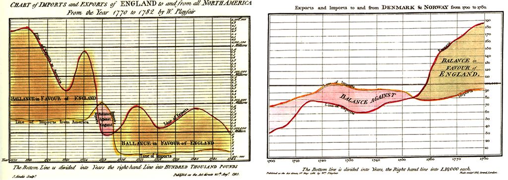
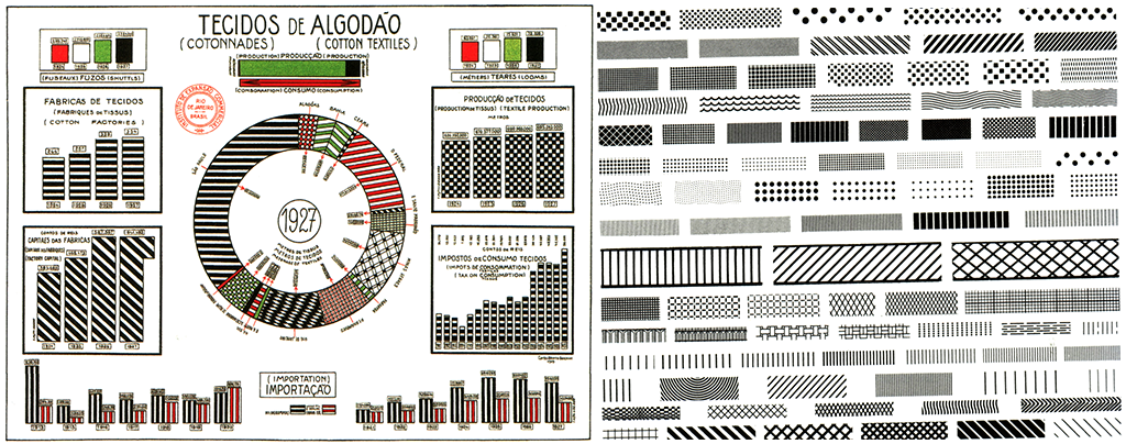
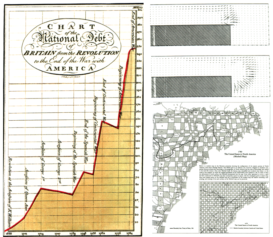
Combination of cartographic and statistical skills.
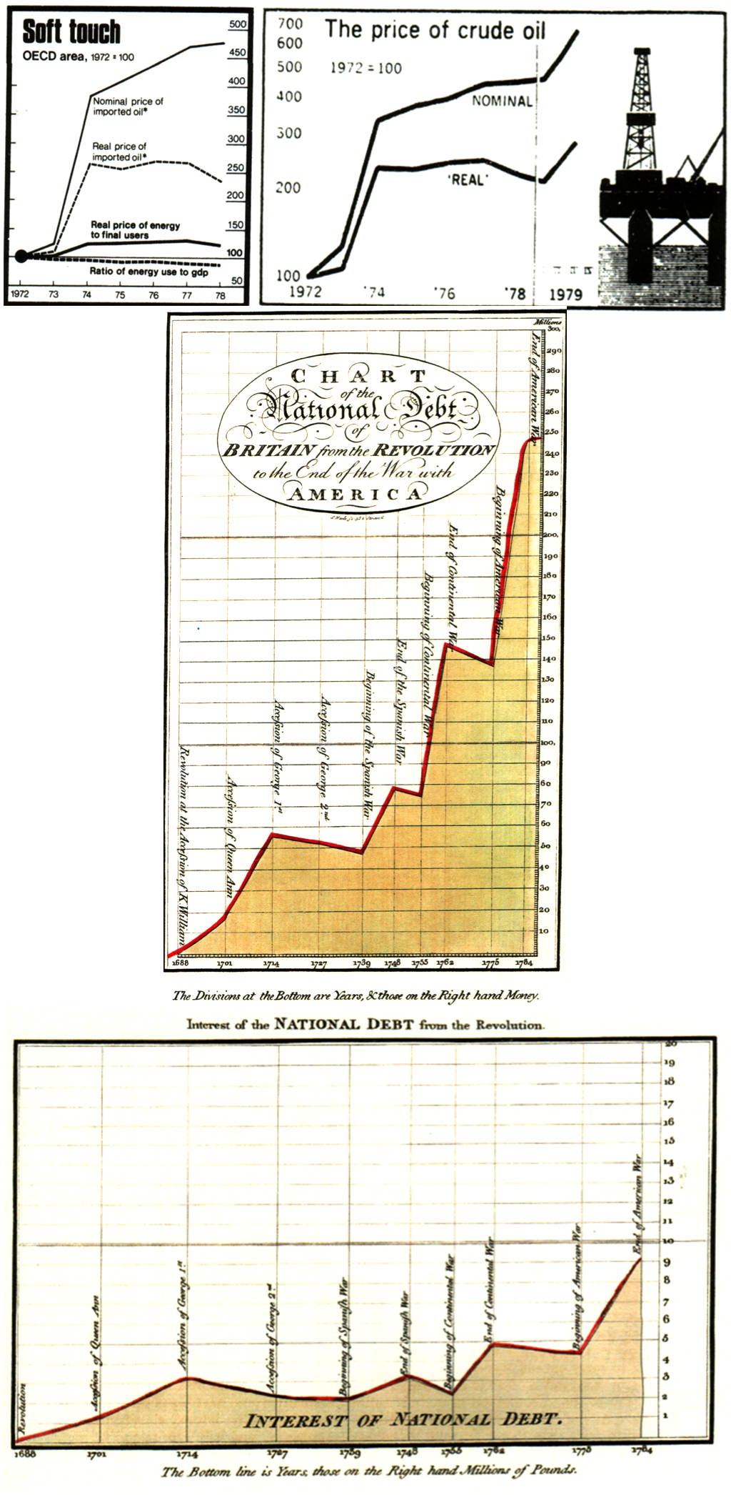
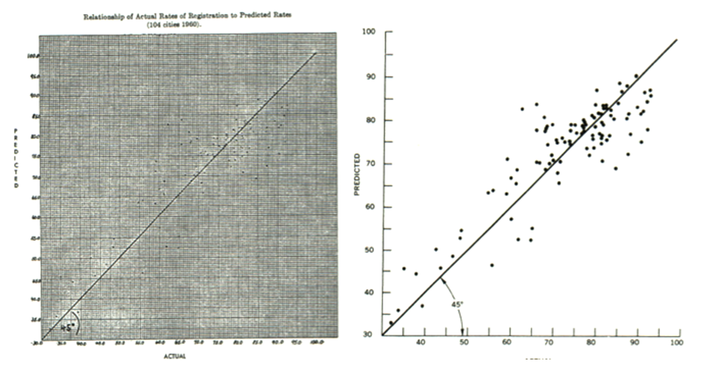
Problem: Simple passage of time is not a good explanatory variable, descriptive chronology is not causal explanation.
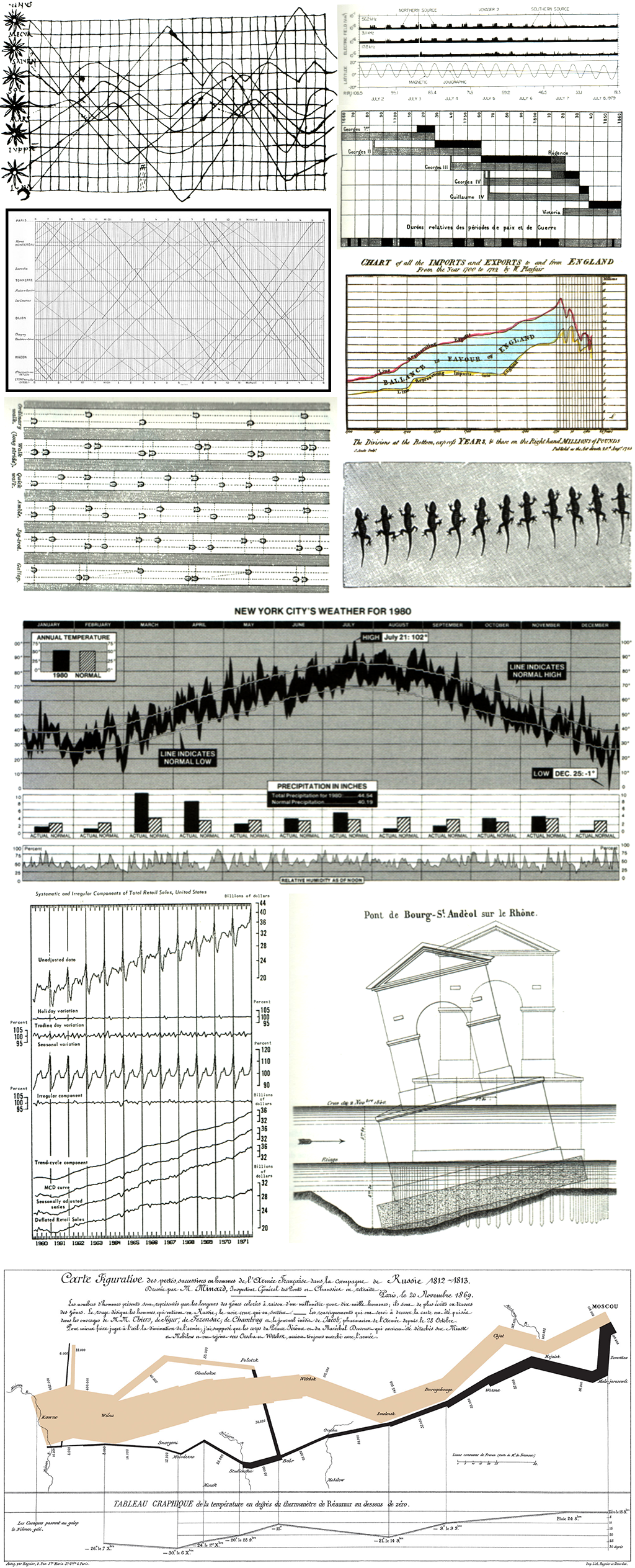
More abstract than time
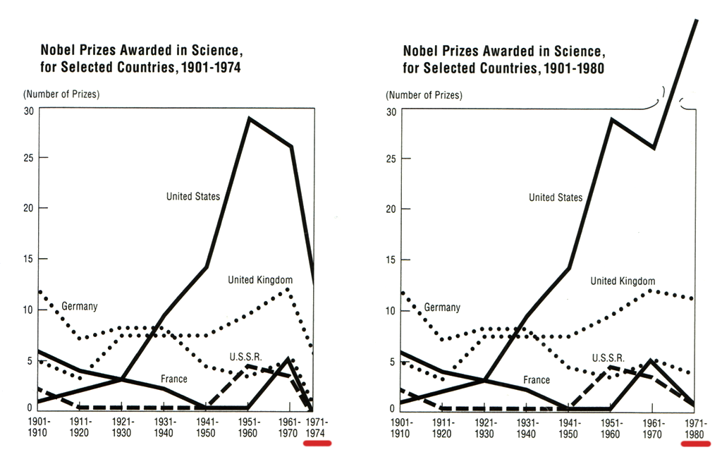
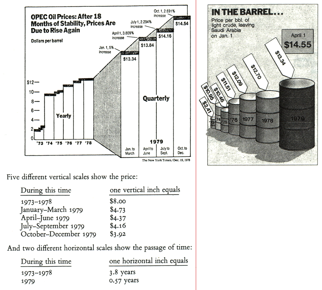
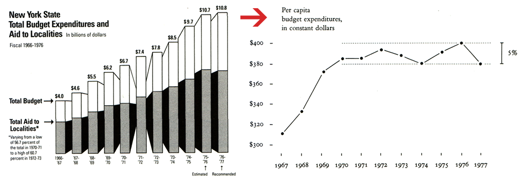
Value of some variables can change over time (eg. money – inflation, population – increase) Make comparisons using inflation-adjusted units of money.
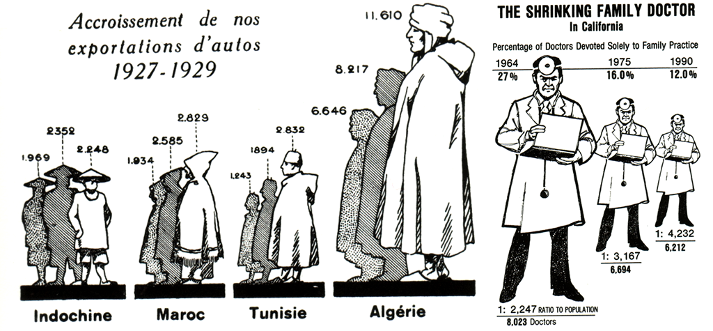
Do not map one-dimensional value to more dimensions (2D area, or even 3D space)
- Producers of graphics are designers, not data analytics or statisticians. Bad or no statistical training
- Dislike of quantitative evidence – "statistical data are boring"
- Contempt for the intelligence of the audience and creating too simple graphics
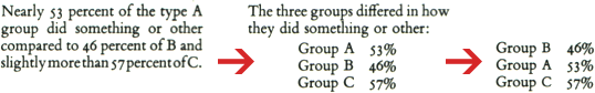
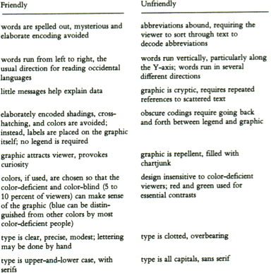
There is double standard of both integrity and sophistication in news publications – one for words, another for graphics. Statistical graphics are stupid, lie, employ only the simples designs and often miss the real news actually in the data.
Do not waste tremendous communicative power of graphics to just decorate a few numbers.
Everyone spook of an information overload, but what there was in fact was non-information overload. [Richard Saul Wurman, What–If, Could-Be]
Data-ink divided by total ink used to print the graphics
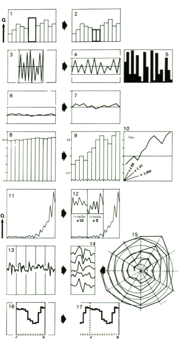
Erase non-data-ink • Erase redundant data-ink • Revise and edit
Use redundancy only to give a context and order or create an aesthetic balance.
statistical graphics should prune out ink that fails to present fresh data-information.
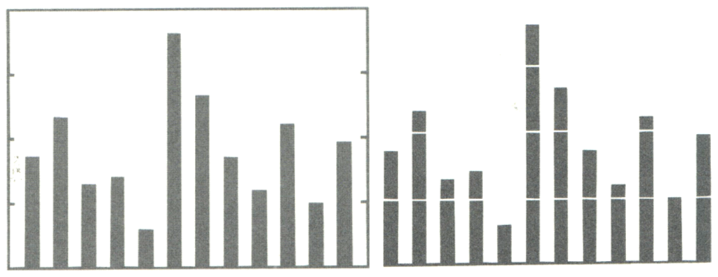
// Barchart - 1 information in 6 separate ways: height of left line, height of shading, height of right line, position of too horizontal line, position of number, number itself
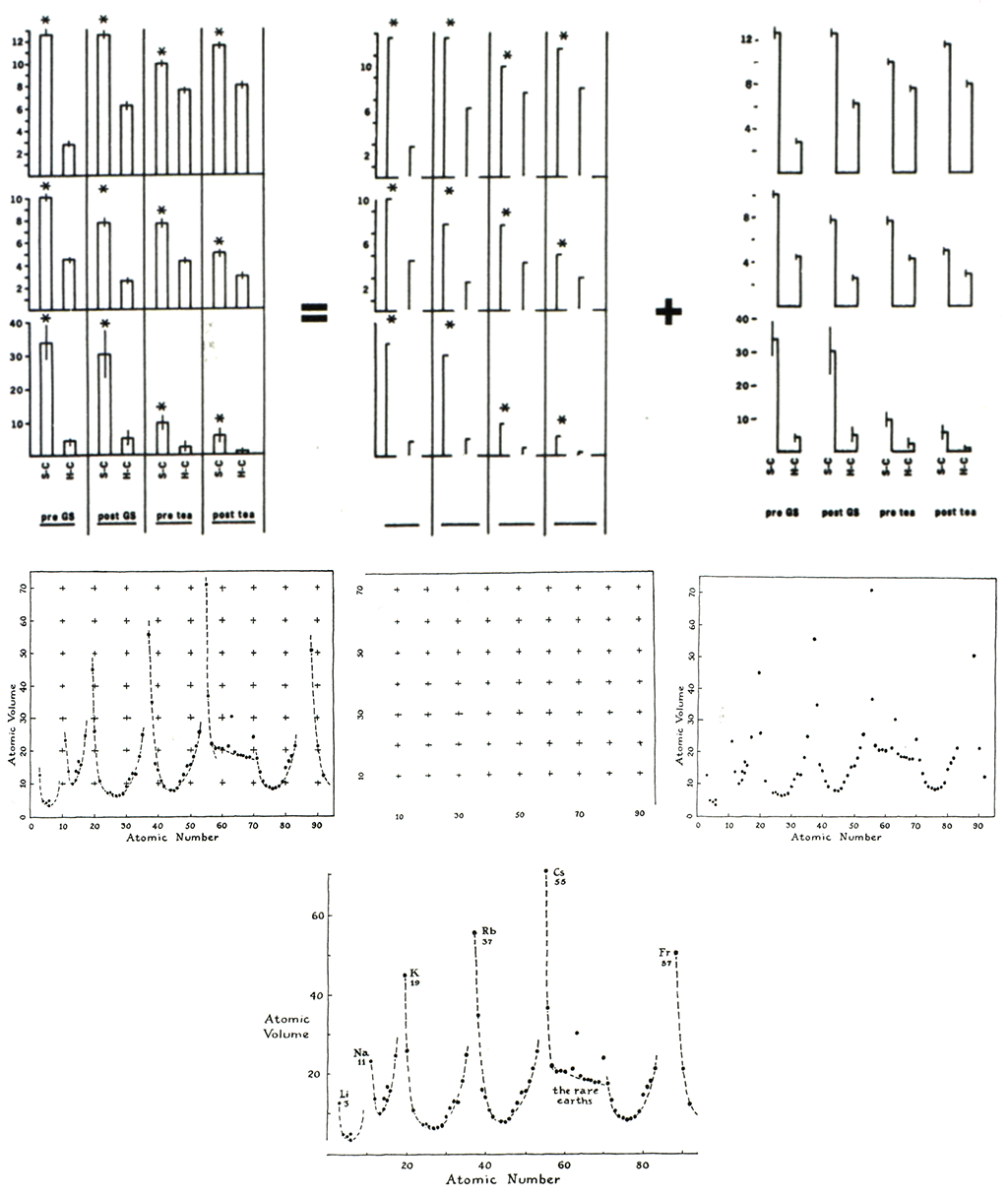
Decoration of graphics generates a lot of ink that does not tell the viewer anything new. It's chart junk.
Graphics should be attractive through the data, not the decoration.
Common chart junk is conventional.
- make graphic appear more scientific
- to enliven the display
- opportunity to exercise artistic skills
It's all right to decorate construction but never construct decoration.
Most of ink should vary in response to data variation.
More information per unit of space / per unit of ink.
Limit of chart innovation – Nothing is lost to those puzzled by the new design and something is gained by those who do understand.
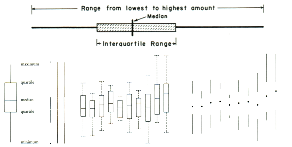
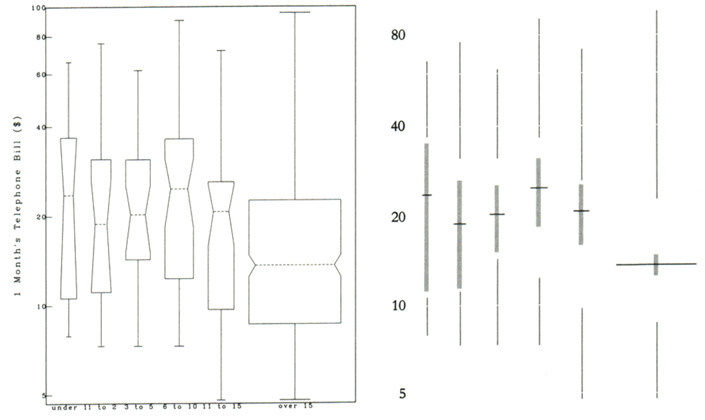
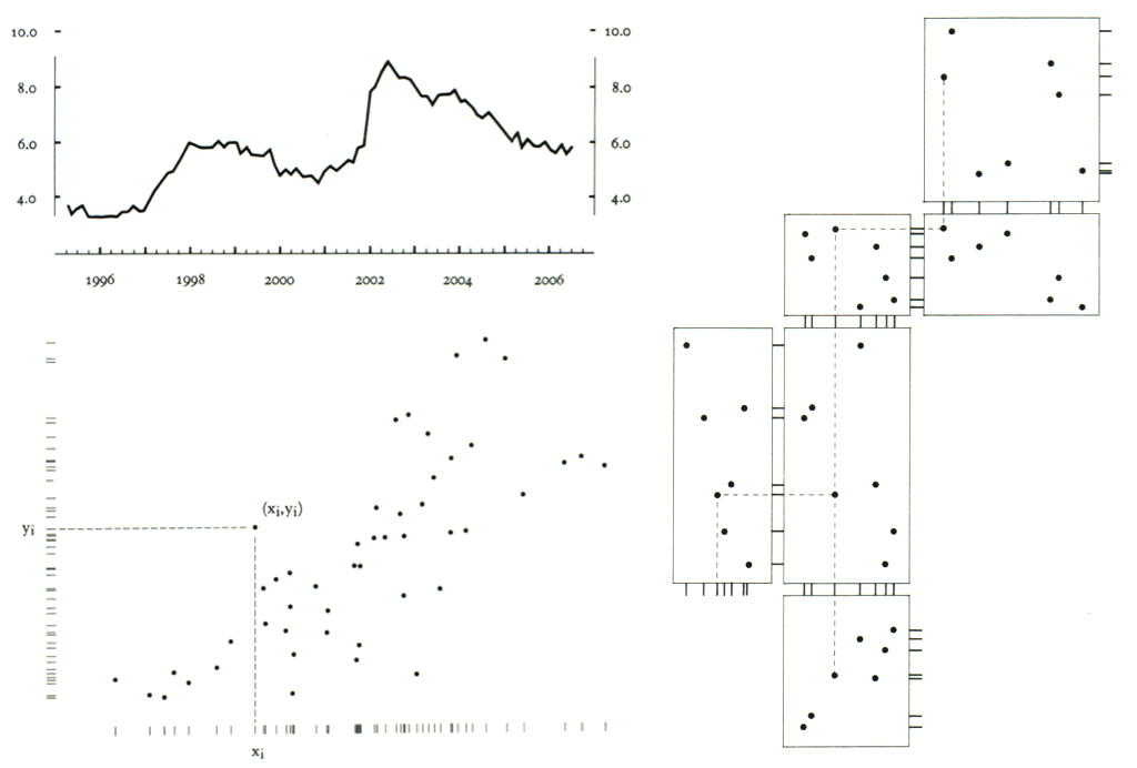
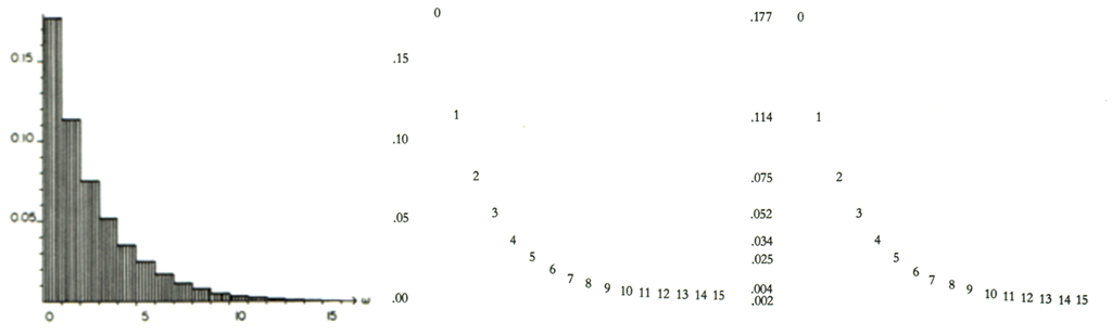
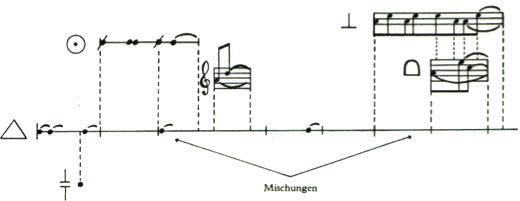
Frame can become an effective data-communication element = range frame // dot-dash-plot (combines marginal frequency distribution & bivariate distribution)
Multi-functioning graphical elements – carry data (several pieces) + design.
Mobilise every graphical element, perhaps several times over, to show the data.
Avoid graphical puzzles.
- Range-frame
- Quartile frame
- Dot-dash-plot
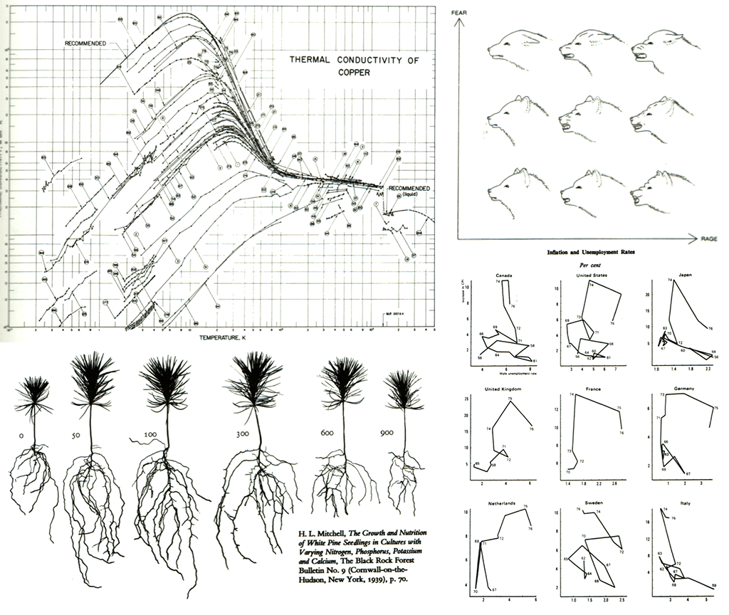
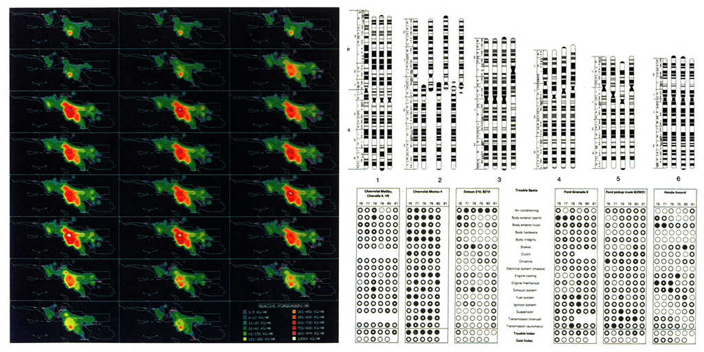
Measures on graph (bar/scatter) can differ also in shape/shading/color to carry third variable.
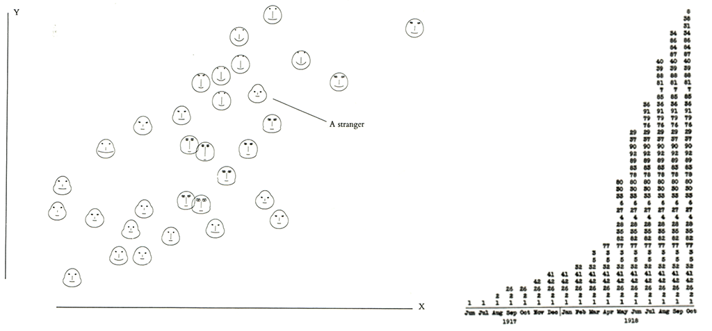
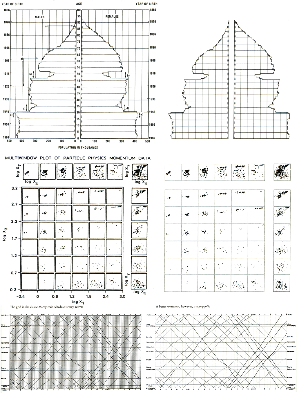
Irregularly spaced grid to important events
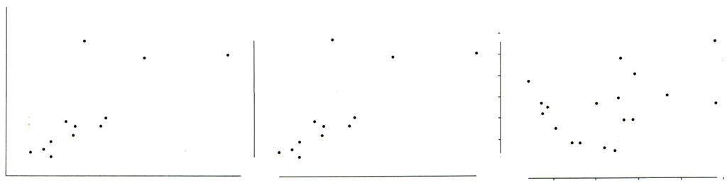
Eyes can make a remarkable number of distinctions within a small area – it just has to be provoked to do so.
For non-data-ink, less is more. For data-ink, less is bore.
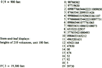
Simple things belongs in tables/text, graphics can give a sense of large and complex data sets.
Density reduction through averaging, clustering, smoothing.
Data-rich designs give a context and credibility to statistical evidence. Low-information designs are suspect.
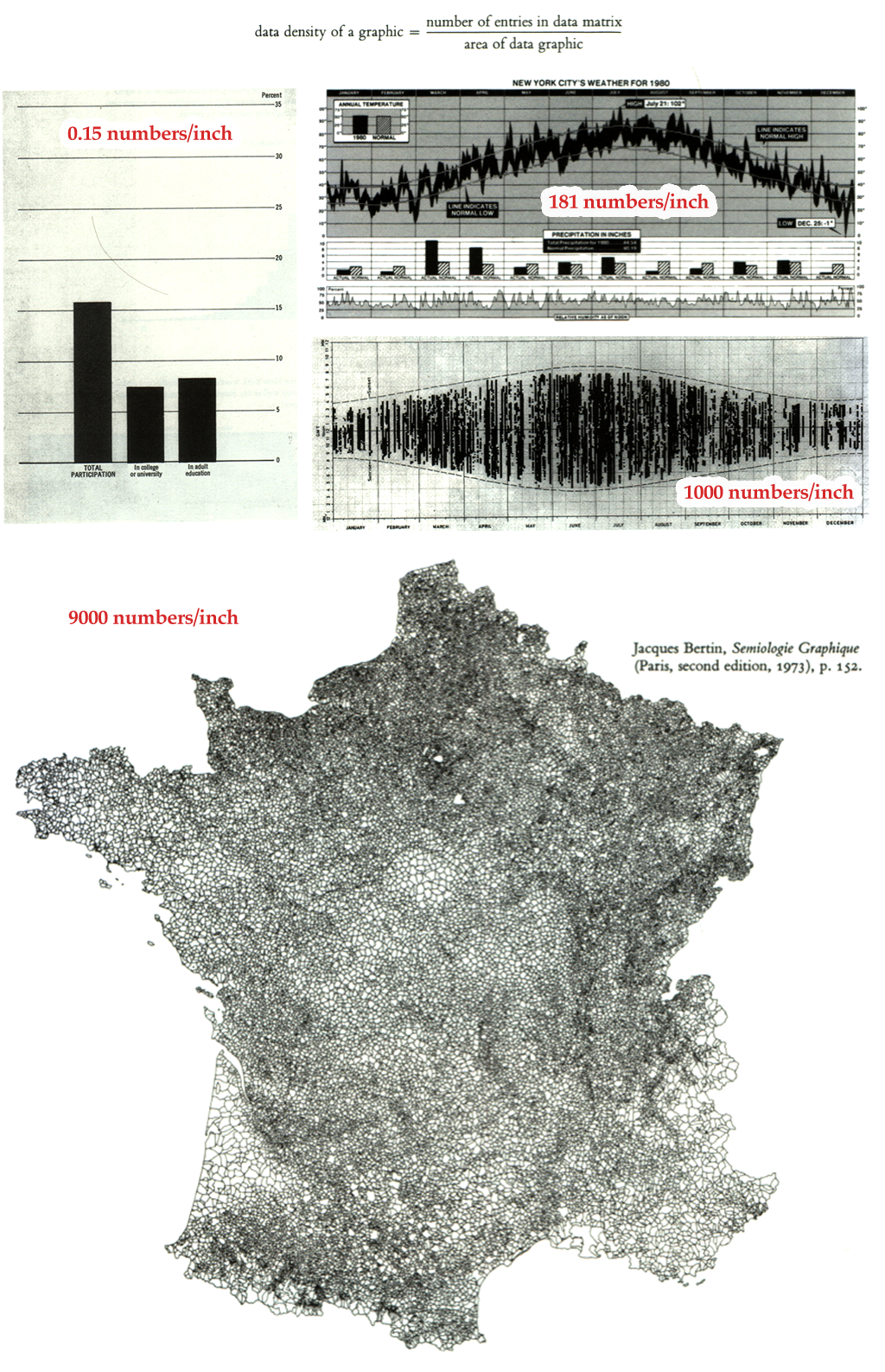
Maximize data density and the size of the data matrix, within reason.
Graphics can be shrunk way down.
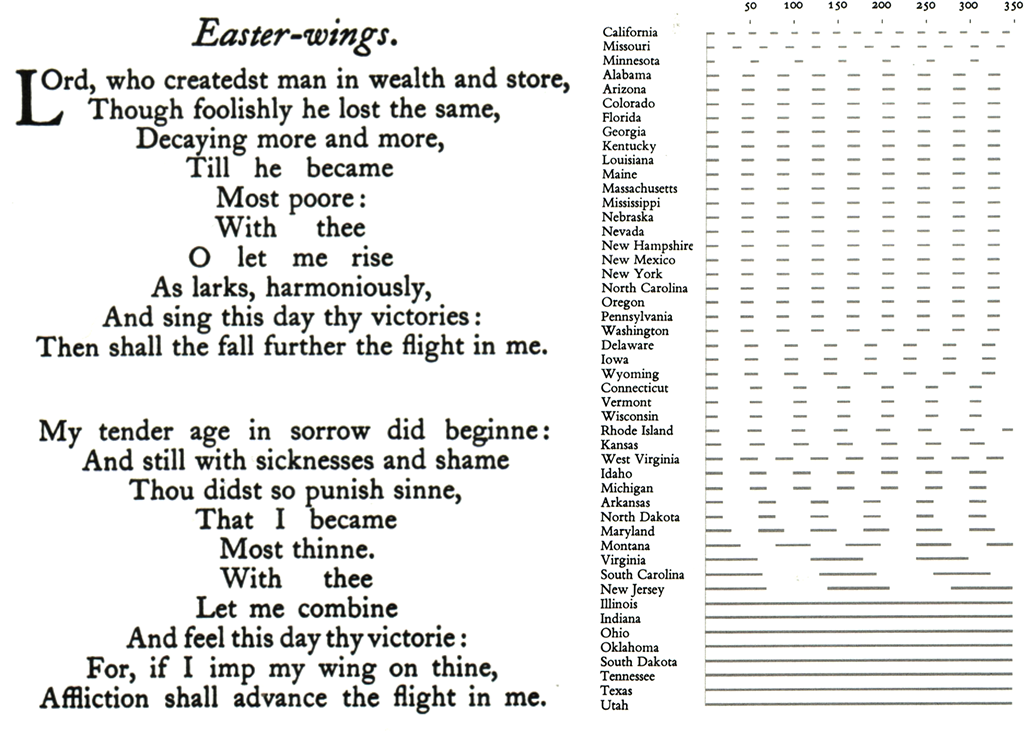
Series of graphics, showing the same combination of variables, indexed by changes in another scale.
Graphical elegance is often found in simplicity of design and complexity of data.
Tables are preferable for many small data sets.
Only worse design than a pie chart is several of them.
Data graphics are paragraphs about data and should be treated as such.
Words, graphics, and tables are different mechanisms with but a single purpose – the presentation of information.
Imagine if graphics were replaced by paragraphs of words and those paragraphs scattered over the pages out of sequence with the rest of the text – that is how graphical and tabular information is now treated in the layout of many published pages, particularly in scientific journals and professional books. [p. 181][#Tufte, Visual Display of Quantitative Information]
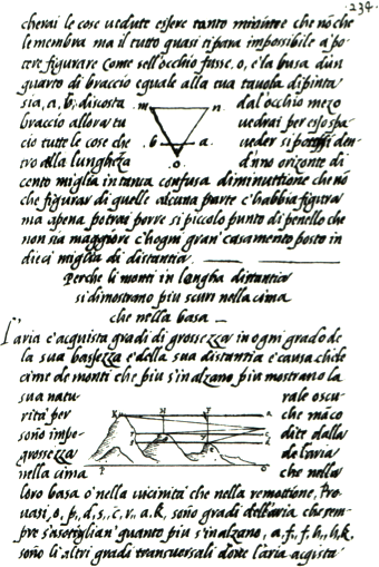
Illustrations were one well-integrated with text, such as those of Newton and Leonardo da Vinci.
Design is choice. The theory of the visual display of quantitative information consists of principles that generate design options and that guide choices among options. The principles should not be applied rigidly or in a peevish spirit; they are not logically or mathematically certain; and it is better to violate any principle than to place graceless or inelegant marks on paper. Most principles of design should be greeted with some skepticism, for word authority can dominate our vision, and we may come to see only through the lenses of word authority rather than with our own eyes.
What is to be sought in designs for the display of information is the clear portrayal of complexity. Not the complication of the simple; rather the task of the designer is to give visual access to the subtle and the difficult – that is the revelation of the complex.